
Web Components: Build Reusable UI Components with Vanilla JavaScript

Learn Web Components step by step by building a reusable UI card with Custom Elements, Shadow DOM, HTML Templates, slots, and JavaScript modules. No framework or build tools required.
Imagine creating a card for your website and then using it in a WordPress theme, a Joomla extension, or a standalone application without rewriting it for each environment.
That's the promise of Web Components: browser-native tools for building reusable HTML elements. No React, Vue, npm packages, or bundler is required for the example we're going to build.
By the end of this tutorial, you'll have a working <ui-card> component with customizable content, isolated styles, a featured variant, a dismiss button, and a public event. We'll build it in small steps so you can see what each technology contributes.
What you'll build
Our finished component will support this HTML:
<ui-card variant="featured">
  <span slot="title">Learn Web Components</span>
  <p>Build reusable interfaces with native JavaScript.</p>
  <a slot="action" href="/tutorial">Read the tutorial</a>
</ui-card>
Visual preview — standard and featured cards
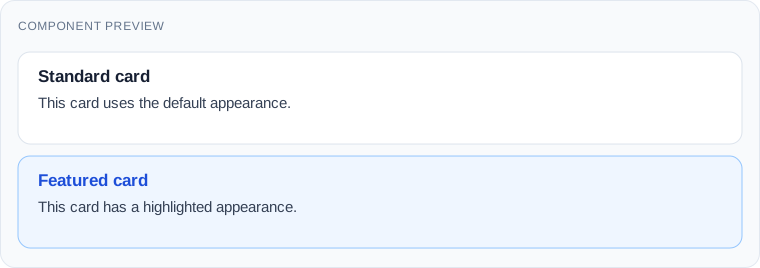
This preview is the design target, not a screenshot of an unrelated library. We'll reproduce it using the code below.
1. Understand the four building blocks
Custom Elements let us register a new HTML tag and its JavaScript behavior. Shadow DOM gives the element its own internal DOM and scoped styles. HTML templates and slots let us reuse structure while inserting different content into each instance. ES Modules let us load the component from a normal JavaScript file.
These are separate features. A Custom Element does not have to use Shadow DOM, and you don't need a framework to use any of them.
2. Create the project files
Create this structure in your editor:
web-components-demo/
├── index.html
├── components/
│   └── ui-card.js
└── css/
    └── main.css
Put this into index.html:
<!doctype html>
<html lang="en">
<head>
  <meta charset="utf-8">
  <meta name="viewport" content="width=device-width, initial-scale=1">
  <title>Web Components Demo</title>
  <link rel="stylesheet" href="./css/main.css">
  <script type="module" src="./components/ui-card.js"></script>
</head>
<body>
  <main class="container">
    <h1>Reusable UI Components</h1>
    <p>Let's build a reusable card without a framework.</p>
    <ui-card></ui-card>
  </main>
</body>
</html>
Add the page-level styles to css/main.css:
body {
  margin: 0;
  background: #f4f6f9;
  color: #1f2937;
  font-family: system-ui, sans-serif;
}
.container {
  max-width: 900px;
  margin: 60px auto;
  padding: 0 20px;
}
ui-card {
  display: block;
  margin-top: 24px;
}
Run a local HTTP server from the project directory, for example:
python -m http.server 8000Visit http://localhost:8000. The heading appears, but the card has no visible content yet. Use an HTTP server rather than opening index.html with file://: browser module-loading rules can block local file imports.
3. Register your first Custom Element
Create components/ui-card.js:
class UiCard extends HTMLElement {
  connectedCallback() {
    this.textContent = 'Hello from a Web Component!';
  }
}

customElements.define('ui-card', UiCard);
Refresh the page. You should now see:
Expected result — Step 3

HTMLElement supplies normal DOM behavior. connectedCallback() runs when the element connects to the document. customElements.define() associates the class with the HTML tag.
The hyphen in ui-card is required for autonomous Custom Element names. The callback can run again if the element is detached and reinserted, which matters when we add initialization logic.
4. Give the card its own design with Shadow DOM
Replace ui-card.js with:
class UiCard extends HTMLElement {
  connectedCallback() {
    if (this.shadowRoot) return;

    const shadow = this.attachShadow({ mode: 'open' });

    shadow.innerHTML = `
      <style>
        article {
          padding: 24px;
          background: white;
          border: 1px solid #dce3ec;
          border-radius: 12px;
        }
        h2 {
          margin: 0 0 12px;
          color: #2563eb;
        }
      </style>
      <article>
        <h2>My reusable card</h2>
        <p>This content lives inside Shadow DOM.</p>
      </article>
    `;
  }
}

customElements.define('ui-card', UiCard);
Expected result — Step 4
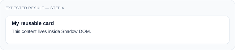
Open DevTools, inspect <ui-card>, and expand #shadow-root (open). You'll see the internal article and stylesheet.
Unlike ordinary document selectors, global CSS such as article { border: none } doesn't normally reach this shadow tree. Inherited properties and CSS custom properties can still cross the boundary. Shadow DOM encapsulates presentation; it is not a security sandbox.
The if (this.shadowRoot) guard prevents attaching a second shadow root if the element reconnects.
5. Separate the layout with an HTML template
Embedding everything inside connectedCallback() becomes awkward as a component grows. Let's define the markup once and clone it for each card.
Replace the file with:
const template = document.createElement('template');

template.innerHTML = `
  <style>
    article {
      padding: 24px;
      background: white;
      border: 1px solid #dce3ec;
      border-radius: 12px;
    }
    h2 {
      margin: 0 0 12px;
      color: #2563eb;
    }
  </style>
  <article>
    <h2>My reusable card</h2>
    <p>Created from an HTML template.</p>
  </article>
`;

class UiCard extends HTMLElement {
  connectedCallback() {
    if (this.shadowRoot) return;
    const shadow = this.attachShadow({ mode: 'open' });
    shadow.appendChild(template.content.cloneNode(true));
  }
}

customElements.define('ui-card', UiCard);
template.content is a document fragment. cloneNode(true) copies the entire structure into each card's shadow tree. The template itself doesn't render until we clone and insert it.
This version looks almost identical. The improvement is architectural: one template can serve many instances.
6. Insert different content using slots
A reusable card isn't useful if every instance has the same heading. Replace only the template declaration at the top of ui-card.js with the following; keep the class and registration code from Step 5.
const template = document.createElement('template');

template.innerHTML = `
  <style>
    article {
      padding: 24px;
      background: white;
      border: 1px solid #dce3ec;
      border-radius: 12px;
    }
    h2 { margin: 0 0 12px; color: #2563eb; }
    .content { line-height: 1.6; }
    .action { margin-top: 16px; }
  </style>
  <article>
    <h2><slot name="title">Untitled card</slot></h2>
    <div class="content"><slot></slot></div>
    <div class="action"><slot name="action"></slot></div>
  </article>
`;
Now replace <ui-card></ui-card> in index.html:
<ui-card>
  <span slot="title">Learn Web Components</span>
  <p>Build reusable interfaces with native JavaScript.</p>
  <a slot="action" href="/tutorial">Read the tutorial</a>
</ui-card>
Expected result — Step 6
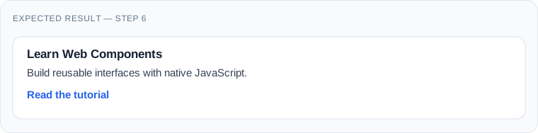
The named slot receives the element marked slot="title". The unnamed slot receives the paragraph. The action slot receives the link. A slot's fallback text appears if nothing is assigned to it.
The layout lives in the component; the actual words and links remain in the page's HTML. This is especially useful for CMS content. Replace /tutorial with a real destination in your project.
7. Create a featured variant with CSS
Inside the template's <style> block, add:
:host {
  display: block;
}
:host([variant="featured"]) article {
  background: #eff6ff;
  border-color: #93c5fd;
}
Then replace the single card in index.html with two cards:
<ui-card>
  <span slot="title">Standard card</span>
  <p>This card uses the default appearance.</p>
</ui-card>

<ui-card variant="featured">
  <span slot="title">Featured card</span>
  <p>This card has a highlighted appearance.</p>
</ui-card>
Expected result — Step 7
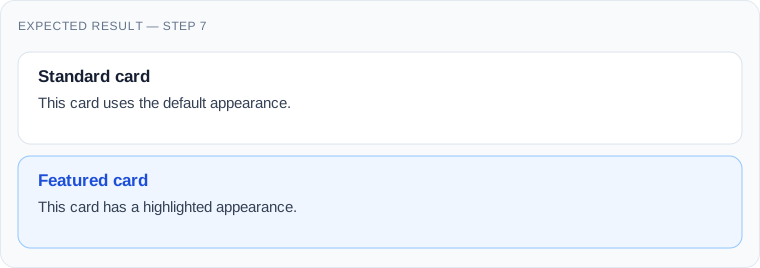
This is a particularly useful feature of :host(): it styles the component based on attributes of the custom element. If JavaScript changes variant later, CSS updates automatically. No attributeChangedCallback() is needed for a purely CSS-driven change.
8. Add a dismiss button and a public event
Let's make the card interactive. Inside the template's <article>, add this button before the heading:
<button class="dismiss" type="button" aria-label="Dismiss card">
  ×
</button>
Add these rules to the template's CSS:
article { position: relative; }
.dismiss {
  position: absolute;
  top: 12px;
  right: 12px;
  width: 32px;
  height: 32px;
  border: 0;
  border-radius: 6px;
  background: transparent;
  color: #475569;
  font-size: 24px;
  cursor: pointer;
}
.dismiss:focus-visible {
  outline: 2px solid #2563eb;
  outline-offset: 2px;
}
Replace connectedCallback() in the class with:
connectedCallback() {
  if (this.shadowRoot) return;

  const shadow = this.attachShadow({ mode: 'open' });
  shadow.appendChild(template.content.cloneNode(true));

  shadow.querySelector('.dismiss').addEventListener('click', () => {
    this.dispatchEvent(new CustomEvent('card-dismissed', {
      bubbles: true,
      composed: true
    }));
    this.remove();
  });
}
In index.html, add this script before </body>:
<script type="module">
  document.addEventListener('card-dismissed', () => {
    console.log('A card was dismissed.');
  });
</script>
Open the browser console and click ×. The card disappears and the console displays the message.
The event provides a public integration point: the surrounding application doesn't need to know anything about the card's internal button. bubbles makes the event bubble; composed permits crossing a shadow boundary where applicable. Here the event originates on the host element itself.
9. Complete final version: copy and use
You can now replace the entire contents of components/ui-card.js with this consolidated version. It adds CSS customization and exported parts while keeping the behavior built in previous steps.
const template = document.createElement('template');

template.innerHTML = `
  <style>
    :host {
      display: block;
      color: #1f2937;
      font-family: system-ui, sans-serif;
    }
    article {
      position: relative;
      box-sizing: border-box;
      padding: 24px;
      background: var(--card-background, #fff);
      border: 1px solid var(--card-border, #dce3ec);
      border-radius: 12px;
    }
    :host([variant="featured"]) article {
      background: var(--card-featured-background, #eff6ff);
      border-color: var(--card-featured-border, #93c5fd);
    }
    h2 {
      margin: 0 36px 12px 0;
      color: var(--card-title-color, #2563eb);
      font-size: 1.25rem;
    }
    .content { line-height: 1.6; }
    .action { margin-top: 16px; }
    .dismiss {
      position: absolute;
      top: 12px;
      right: 12px;
      width: 32px;
      height: 32px;
      border: 0;
      border-radius: 6px;
      background: transparent;
      color: #475569;
      font-size: 24px;
      cursor: pointer;
    }
    .dismiss:hover { background: rgba(0, 0, 0, 0.06); }
    .dismiss:focus-visible {
      outline: 2px solid #2563eb;
      outline-offset: 2px;
    }
  </style>
  <article part="container">
    <button class="dismiss" type="button"
            aria-label="Dismiss card">×</button>
    <h2 part="title"><slot name="title">Untitled card</slot></h2>
    <div class="content"><slot></slot></div>
    <div class="action"><slot name="action"></slot></div>
  </article>
`;

class UiCard extends HTMLElement {
  connectedCallback() {
    if (this.shadowRoot) return;

    const shadow = this.attachShadow({ mode: 'open' });
    shadow.appendChild(template.content.cloneNode(true));

    shadow.querySelector('.dismiss').addEventListener('click', () => {
      this.dispatchEvent(new CustomEvent('card-dismissed', {
        bubbles: true,
        composed: true,
        detail: {
          variant: this.getAttribute('variant') || 'default'
        }
      }));
      this.remove();
    });
  }
}

if (!customElements.get('ui-card')) {
  customElements.define('ui-card', UiCard);
}
Unlike a quick demo, this version doesn't attempt to attach the shadow root twice, doesn't insert untrusted content with innerHTML, and doesn't rely on a framework. The template string is developer-controlled; never interpolate untrusted user input into it.
10. Style it from the hosting website
Shadow DOM isn't meant to make customization impossible. It encourages you to define an intentional styling interface.
In css/main.css, add:
ui-card {
  --card-border: #cbd5e1;
  --card-title-color: #0f766e;
}
ui-card::part(container) {
  box-shadow: 0 8px 24px rgba(0, 0, 0, 0.08);
}
The custom properties are inherited by the shadow tree and control the values we exposed. The part="container" attribute lets external CSS target a selected internal element with ::part(container).
If you need a different featured background, use --card-featured-background. This is preferable to forcing consumers to depend on the exact internal DOM structure.
11. Reuse the card in WordPress, Joomla, or plain HTML
Copy ui-card.js into the target website and load it as a JavaScript module:
<script type="module" src="/assets/js/ui-card.js"></script>Then use <ui-card> in the page markup. In WordPress, register assets through the theme or plugin's supported script-loading APIs, using module support appropriate to your WordPress version. In Joomla, use the Web Asset Manager to register and load the module. Don't scatter hardcoded script tags through production templates.
For a CMS-generated card, render the title, paragraph, and link as slotted HTML. Escape content and attributes according to the CMS's output rules.
Practical benefit: a Joomla module and a WordPress block can both output the same custom tag while sharing one component implementation. Each CMS remains responsible for fetching and escaping its own content.
12. Accessibility, SEO, and progressive enhancement
Use native HTML controls inside components whenever possible. Our dismiss action uses a real button, which supplies keyboard activation semantics, and an aria-label because × alone isn't descriptive.
If a user dismisses a card with keyboard focus, consider where focus should go next in a more complex interface. Dialogs, menus, and comboboxes need much more accessibility behavior than this example.
Keep important content in meaningful light-DOM markup where practical. If JavaScript fails, the browser won't upgrade <ui-card>; the slotted heading and paragraph remain in the document, though the component's styled shell and dismiss button won't exist.
For search engines, don't assume that JavaScript-only content is indexed identically in every crawler. Critical content should be available in the initial HTML or through an appropriate rendering strategy.
Shadow DOM also has limitations: ordinary document CSS selectors don't style internal nodes, and some ARIA ID relationships cannot cross shadow boundaries. Design component APIs with those constraints in mind.
13. Are Web Components always faster?
Not necessarily. Web Components avoid requiring a particular framework runtime, but performance depends on the amount of JavaScript, DOM complexity, rendering frequency, and application architecture.
A small card is a good candidate. Hundreds of complex elements with unnecessary DOM rebuilding may still be slow. Reuse templates, avoid repeated full rendering, and measure real performance.
For a large application already built around a framework's state management and routing, using that framework's own components may be simpler. Web Components shine when a stable UI element needs to cross framework or CMS boundaries.
14. Troubleshooting
| Symptom | Likely cause | What to check |
|---|---|---|
| Card is empty | Module didn't load | DevTools console, URL, server MIME type |
customElements.define throws |
Invalid or duplicate name | Hyphen requirement and registration guard |
| CSS doesn't apply inside card | Shadow DOM boundary | Use custom properties, :host, or ::part |
| Content appears in wrong place | Slot name mismatch | Compare slot="title" with <slot name="title"> |
| Clicking dismiss does nothing | Template button missing | Inspect shadow tree and console |
| Component fails when moved | Initialization runs twice | Guard shadow root creation |
| Link leads to 404 | Example URL wasn't replaced | Use an existing destination |
Remember that connectedCallback() can run more than once. The guard in our final example keeps the initialization one-time; more sophisticated components may need to attach and remove external observers or global event listeners during their connection lifecycle.
15. When should you use Web Components?
Choose them when a component needs a reusable, documented HTML interface across several websites, frameworks, or CMS environments. Cards, notifications, product widgets, and small interactive tools are good candidates.
Skip the abstraction when a few lines of ordinary HTML and CSS already solve the problem. And don't recreate native controls without a strong reason.
A useful test: would another application benefit from using this element without knowing how it was implemented? If yes, a Web Component is worth considering.
Conclusion
You've built a real reusable component, not just read about a browser API. It has a custom tag, scoped styling, configurable content, a featured variant, and an event that other code can listen to.
Start with one component that appears repeatedly in your projects. Give it a small public API, test it in more than one layout, and keep its dependencies minimal.
The long-term value of Web Components isn't that they replace every framework. It's that they let useful interface elements outlive the framework or CMS that first hosted them.