
Web Components:使用原生 JavaScript 构建可复用的 UI 组件

通过构建一个可复用的 UI 卡片,逐步学习 Web Components,涵盖 Custom Elements、Shadow DOM、HTML Templates、slots 和 JavaScript 模块。无需任何框架或构建工具。
Web Components: 使用 Vanilla JavaScript 构建可重用的 UI 组件
想象为你的网站创建一个卡片,然后在 WordPress 主题、Joomla 扩展或独立应用中使用它,无需为每个环境重写它。
这就是 Web Components 的承诺:构建可重用 HTML 元素的浏览器原生工具。对我们即将构建的示例,不需要 React、Vue、npm 包或打包器。
本教程结束时,你将拥有一个带有 <ui-card> 的组件,具备可定制内容、隔离样式、特色变体、 dismiss 按钮和公共事件。我们将分步构建,以便你了解每项技术的贡献。
你将构建的内容
我们的完成组件将支持以下 HTML:
<ui-card variant="featured">
  <span slot="title">Learn Web Components</span>
  <p>Build reusable interfaces with native JavaScript.</p>
  <a slot="action" href="/tutorial">Read the tutorial</a>
</ui-card>
视觉预览 — 标准和特色卡片
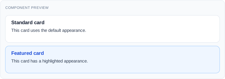
此预览是设计目标,而不是 unrelated 库的截图。我们将使用下面的代码来复现它。
1. 理解四个构建块
Custom Elements 让我们注册一个新的 HTML 标签及其 JavaScript 行为。 Shadow DOM 给元素自己的内部 DOM 和范围样式。 HTML templates and slots 让我们重用结构,同时将不同内容插入到每个实例中。 ES Modules 让我们从正常的 JavaScript 文件加载组件。
这些是单独的特性。Custom Element 不必使用 Shadow DOM,你不需要框架来使用其中任何一个。
2. 创建项目文件
在编辑器中创建此结构:
web-components-demo/
├── index.html
├── components/
│   └── ui-card.js
└── css/
    └── main.css
将这段代码放入 index.html:
<!doctype html>
<html lang="en">
<head>
  <meta charset="utf-8">
  <meta name="viewport" content="width=device-width, initial-scale=1">
  <title>Web Components Demo</title>
  <link rel="stylesheet" href="./css/main.css">
  <script type="module" src="./components/ui-card.js"></script>
</head>
<body>
  <main class="container">
    <h1>Reusable UI Components</h1>
    <p>Let's build a reusable card without a framework.</p>
    <ui-card></ui-card>
  </main>
</body>
</html>
将页面级样式添加到 css/main.css:
body {
  margin: 0;
  background: #f4f6f9;
  color: #1f2937;
  font-family: system-ui, sans-serif;
}
.container {
  max-width: 900px;
  margin: 60px auto;
  padding: 0 20px;
}
ui-card {
  display: block;
  margin-top: 24px;
}
从项目目录运行本地 HTTP 服务器,例如:
python -m http.server 8000访问 http://localhost:8000。标题出现,但卡片目前没有可见内容。使用 HTTP 服务器而不是用 index.html 打开 file://:浏览器模块加载规则可能会阻止本地文件导入。
3. 注册你的第一个 Custom Element
创建 components/ui-card.js:
class UiCard extends HTMLElement {
  connectedCallback() {
    this.textContent = 'Hello from a Web Component!';
  }
}

customElements.define('ui-card', UiCard);
刷新页面。你应该现在看到:
Expected result — Step 3

HTMLElement 供给正常的 DOM 行为。 connectedCallback() 在元素连接到文档时运行。 customElements.define() 将类与 HTML 标签关联。
标签名中的 ui-card 是自主 Custom Element 名称所必需的。当元素从文档中分离并重新插入时,回调可以再次运行,这在我们添加初始化逻辑时很重要。
4. 使用 Shadow DOM 给卡片自己的设计
将 ui-card.js 替换为:
class UiCard extends HTMLElement {
  connectedCallback() {
    if (this.shadowRoot) return;

    const shadow = this.attachShadow({ mode: 'open' });

    shadow.innerHTML = `
      <style>
        article {
          padding: 24px;
          background: white;
          border: 1px solid #dce3ec;
          border-radius: 12px;
        }
        h2 {
          margin: 0 0 12px;
          color: #2563eb;
        }
      </style>
      <article>
        <h2>My reusable card</h2>
        <p>This content lives inside Shadow DOM.</p>
      </article>
    `;
  }
}

customElements.define('ui-card', UiCard);
Expected result — Step 4
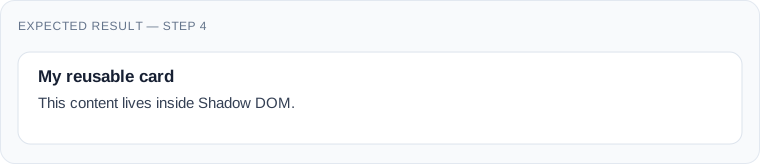
打开 DevTools,检查 <ui-card>,并展开 #shadow-root (open)。你会看到内部 article 和样式表。
与普通文档选择器不同,全局 CSS such as article { border: none } 不会正常达到这个 shadow tree。继承属性和 CSS 自定义属性仍然可以跨越边界。Shadow DOM 封装了呈现;它不是安全沙箱。
if (this.shadowRoot) 守卫防止在元素重新连接时附加第二个 shadow root。
5. 使用 HTML template 分离布局
在 connectedCallback() 中嵌入一切随着组件增长变得笨拙。让我们一次性定义标记,并为每个卡片克隆它。
将文件替换为:
const template = document.createElement('template');

template.innerHTML = `
  <style>
    article {
      padding: 24px;
      background: white;
      border: 1px solid #dce3ec;
      border-radius: 12px;
    }
    h2 {
      margin: 0 0 12px;
      color: #2563eb;
    }
  </style>
  <article>
    <h2>My reusable card</h2>
    <p>Created from an HTML template.</p>
  </article>
`;

class UiCard extends HTMLElement {
  connectedCallback() {
    if (this.shadowRoot) return;
    const shadow = this.attachShadow({ mode: 'open' });
    shadow.appendChild(template.content.cloneNode(true));
  }
}

customElements.define('ui-card', UiCard);
template.content 是一个文档片段。 cloneNode(true) 将整个结构克隆到每个卡片的 shadow tree 中。模板本身不会渲染,直到我们克隆并插入它。
此版本几乎相同。改进是体系结构的:一个模板可以服务于许多实例。
6. 使用 slots 插入不同内容
一个可重用的卡片如果每个实例都有相同的标题就没用了。只替换 ui-card.js 顶部的 only the template declaration; 保留步骤 5 中的类和注册代码。
const template = document.createElement('template');

template.innerHTML = `
  <style>
    article {
      padding: 24px;
      background: white;
      border: 1px solid #dce3ec;
      border-radius: 12px;
    }
    h2 { margin: 0 0 12px; color: #2563eb; }
    .content { line-height: 1.6; }
    .action { margin-top: 16px; }
  </style>
  <article>
    <h2><slot name="title">Untitled card</slot></h2>
    <div class="content"><slot></slot></div>
    <div class="action"><slot name="action"></slot></div>
  </article>
`;
现在在 index.html 中替换 <ui-card></ui-card>:
<ui-card>
  <span slot="title">Learn Web Components</span>
  <p>Build reusable interfaces with native JavaScript.</p>
  <a slot="action" href="/tutorial">Read the tutorial</a>
</ui-card>
Expected result — Step 6
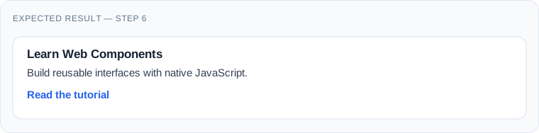
已命名的 slot 接收标记为 slot="title" 的元素。未命名的 slot 接收段落。action slot 接收链接。如果没有分配给它的内容,slot 的回落文本会出现。
布局驻留在组件中;实际的文字和链接保留在页面的 HTML 中。这对于 CMS 内容特别有用。将 /tutorial 替换为项目中的真实目标。
7. 使用 CSS 创建特色变体
在模板的 <style> 块中,添加:
:host {
  display: block;
}
:host([variant="featured"]) article {
  background: #eff6ff;
  border-color: #93c5fd;
}
然后用两个卡片替换 index.html 中的单张卡片:
<ui-card>
  <span slot="title">Standard card</span>
  <p>This card uses the default appearance.</p>
</ui-card>

<ui-card variant="featured">
  <span slot="title">Featured card</span>
  <p>This card has a highlighted appearance.</p>
</ui-card>
Expected result — Step 7
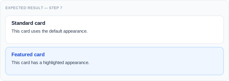
这是 :host() 特别有用的功能:它基于自定义元素的属性对组件进行样式设置。如果 JavaScript 以后修改 variant,CSS 会自动更新。不需要 attributeChangedCallback() 进行纯 CSS 驱动的变化。
8. 添加 dismiss button 和 public event
让卡片变得交互。在模板的 <article> 中,在 heading 之前添加这个按钮:
<button class="dismiss" type="button" aria-label="Dismiss card">
  ×
</button>
将这些规则添加到模板的 CSS 中:
article { position: relative; }
.dismiss {
  position: absolute;
  top: 12px;
  right: 12px;
  width: 32px;
  height: 32px;
  border: 0;
  border-radius: 6px;
  background: transparent;
  color: #475569;
  font-size: 24px;
  cursor: pointer;
}
.dismiss:focus-visible {
  outline: 2px solid #2563eb;
  outline-offset: 2px;
}
用以下内容替换 connectedCallback() 中的类:
connectedCallback() {
  if (this.shadowRoot) return;

  const shadow = this.attachShadow({ mode: 'open' });
  shadow.appendChild(template.content.cloneNode(true));

  shadow.querySelector('.dismiss').addEventListener('click', () => {
    this.dispatchEvent(new CustomEvent('card-dismissed', {
      bubbles: true,
      composed: true
    }));
    this.remove();
  });
}
在 index.html 中,在 </body> 之前添加这段脚本:
<script type="module">
  document.addEventListener('card-dismissed', () => {
    console.log('A card was dismissed.');
  });
</script>
在浏览器控制台中点击 ×。卡片消失,控制台显示消息。
事件提供了一个公共集成点: surrounding application 不需要知道卡片内部按钮的任何信息。 bubbles 使事件冒泡; composed 允许跨越 shadow boundary(在适用的情况下)。这里事件本身在 host 元素上触发。
9. 完整最终版本:复制并使用
现在你可以将 components/ui-card.js 的全部内容替换为此合并版本。它添加 CSS 自定义和 exported parts,同时保持之前步骤中构建的行为。
const template = document.createElement('template');

template.innerHTML = `
  <style>
    :host {
      display: block;
      color: #1f2937;
      font-family: system-ui, sans-serif;
    }
    article {
      position: relative;
      box-sizing: border-box;
      padding: 24px;
      background: var(--card-background, #fff);
      border: 1px solid var(--card-border, #dce3ec);
      border-radius: 12px;
    }
    :host([variant="featured"]) article {
      background: var(--card-featured-background, #eff6ff);
      border-color: var(--card-featured-border, #93c5fd);
    }
    h2 {
      margin: 0 36px 12px 0;
      color: var(--card-title-color, #2563eb);
      font-size: 1.25rem;
    }
    .content { line-height: 1.6; }
    .action { margin-top: 16px; }
    .dismiss {
      position: absolute;
      top: 12px;
      right: 12px;
      width: 32px;
      height: 32px;
      border: 0;
      border-radius: 6px;
      background: transparent;
      color: #475569;
      font-size: 24px;
      cursor: pointer;
    }
    .dismiss:hover { background: rgba(0, 0, 0, 0.06); }
    .dismiss:focus-visible {
      outline: 2px solid #2563eb;
      outline-offset: 2px;
    }
  </style>
  <article part="container">
    <button class="dismiss" type="button"
            aria-label="Dismiss card">×</button>
    <h2 part="title"><slot name="title">Untitled card</slot></h2>
    <div class="content"><slot></slot></div>
    <div class="action"><slot name="action"></slot></div>
  </article>
`;

class UiCard extends HTMLElement {
  connectedCallback() {
    if (this.shadowRoot) return;

    const shadow = this.attachShadow({ mode: 'open' });
    shadow.appendChild(template.content.cloneNode(true));

    shadow.querySelector('.dismiss').addEventListener('click', () => {
      this.dispatchEvent(new CustomEvent('card-dismissed', {
        bubbles: true,
        composed: true,
        detail: {
          variant: this.getAttribute('variant') || 'default'
        }
      }));
      this.remove();
    });
  }
}

if (!customElements.get('ui-card')) {
  customElements.define('ui-card', UiCard);
}
与快速演示不同,此版本不尝试两次附加 shadow root,不使用 innerHTML 插入不受信任的内容,也不依赖框架。模板字符串由开发者控制;永远不要在其中插入不可信的用户输入。
10. 从托管网站进行样式设置
Shadow DOM 不 meant to make customization impossible. It encourages you to define an intentional styling interface.
在 css/main.css,添加:
ui-card {
  --card-border: #cbd5e1;
  --card-title-color: #0f766e;
}
ui-card::part(container) {
  box-shadow: 0 8px 24px rgba(0, 0, 0, 0.08);
}
自定义属性由 shadow tree 继承并控制我们暴露的值。 part="container" 属性让外部 CSS 使用 ::part(container) 目标选中内部元素。
如果你需要不同的特色背景,使用 --card-featured-background。这比强制消费者依赖确切的内部 DOM 结构更可取。
11. 在 WordPress、Joomla 或 plain HTML 中重用卡片
将 ui-card.js 复制到目标网站,并将其作为 JavaScript module 加载:
<script type="module" src="/assets/js/ui-card.js"></script>然后在页面标记中使用 <ui-card>。在 WordPress 中,通过主题或插件的支持的脚本加载 API 注册资产,使用适用于你 WordPress 版本的模块支持。在 Joomla 中,使用 Web Asset Manager 注册和加载模块。不要在生成模板中散布硬编码的 script 标签。
对于 CMS 生成的卡片,使用 slotted HTML 渲染标题、段落和链接。根据 CMS 的输出规则转义内容和属性。
实际利益:一个 Joomla 模块和一个 WordPress block 可以都输出相同的自定义标签,同时共享一个组件实现。每个 CMS 仍然负责获取和转义自己的内容。
12. 无障碍、SEO 和 progressive enhancement
在组件中尽可能使用原生 HTML 控件。我们的 dismiss 操作使用一个真实的 button,它供给键盘激活语义,以及一个 aria-label,因为单独的 × 不具描述性。
如果用户用键盘焦点 dismiss 卡片,考虑在更复杂的界面中焦点应该去哪里。对话框、菜单和组合框需要比这个例子多得多的无障碍行为。
尽可能在有意义的 light-DOM 标记中保留重要内容。如果 JavaScript 失败,浏览器不会升级 <ui-card>;槽内容仍然留在文档中,尽管组件的 styled shell 和 dismiss button 不会存在。
对于搜索引擎,不要假设只有 JavaScript 的内容被所有爬虫以相同的方式索引。关键内容应可用于初始 HTML 或通过适当的渲染策略。
Shadow DOM 也有局限性:普通文档 CSS 选择器不 style 内部节点,某些 ARIA ID 关系无法跨越 shadow 边界。在设计组件 API 时要考虑到这些约束。
13. Web Components 总是更快吗?
不 necessarily。Web Components 避免需要特定的框架运行时,但性能取决于 JavaScript 的数量、DOM 复杂度、渲染频率和应用架构。
一个小卡片是一个很好的候选。具有不必要的 DOM 重建的数百个复杂元素可能仍然缓慢。复用模板,避免重复的完整渲染,并测量实际性能。
对于一个已经围绕框架的状态管理和路由构建的大型应用,使用框架自己的组件可能更简单。Web Components 闪耀时,是一个稳定的 UI 元素需要跨框架或 CMS 边界时。
14. 故障排除
| Symptom | Likely cause | What to check |
|---|---|---|
| Card is empty | Module didn't load | DevTools console, URL, server MIME type |
customElements.define throws |
Invalid or duplicate name | Hyphen requirement and registration guard |
| CSS doesn't apply inside card | Shadow DOM boundary | Use custom properties, :host, or ::part |
| Content appears in wrong place | Slot name mismatch | Compare slot="title" with <slot name="title"> |
| Clicking dismiss does nothing | Template button missing | Inspect shadow tree and console |
| Component fails when moved | Initialization runs twice | Guard shadow root creation |
| Link leads to 404 | Example URL wasn't replaced | Use an existing destination |
Remember that connectedCallback() can run more than once. The guard in our final example keeps the initialization one-time; more sophisticated components may need to attach and remove external observers or global event listeners during their connection lifecycle.
15. 何时使用 Web Components?
当一个组件需要跨多个网站、框架或 CMS 环境具有可重用、已文档化的 HTML 接口时,选择它们。卡片、通知、产品小部件和小型交互工具是良好的候选。
抽象化时,如果少量的普通 HTML 和 CSS 已经解决了问题。并且没有强理由重新创建原生控件。
有用的测试:另一个应用是否可以在不了解其实现方式的情况下使用这个元素?如果是,Web Components 值得考虑。
结论
你构建了一个真实的可重用组件,而不仅仅是阅读浏览器 API。它有一个自定义标签、作用域样式、可配置内容、特色变体和一个其他代码可以监听的事件。
从一个在你的项目中反复出现的组件开始。给它一个小的公共 API,在多于一个的布局中测试它,并保持其依赖最小。
Web Components 的长期价值不在于它们替代每个框架。在于它们让有用的界面元素超越最初托管它们的框架或 CMS。