
CSS Container Queries v roce 2026: Vytvořte responzivní komponenty bez breakpointů viewportu
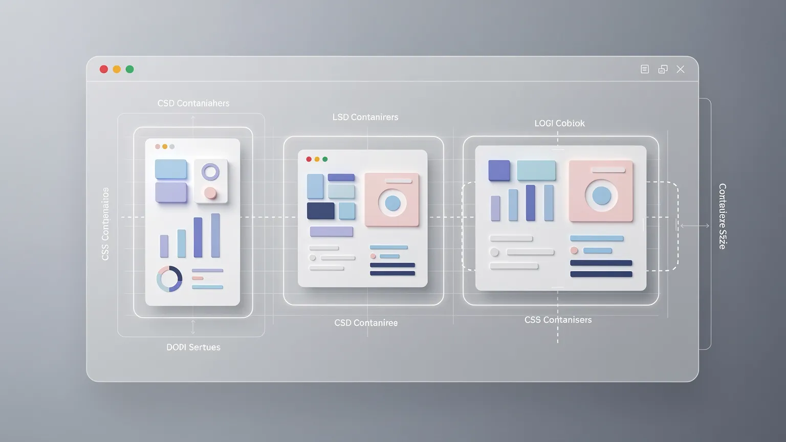
Naučte se, jak CSS container queries umožňují responzivním komponentám přizpůsobit se dostupnému prostoru místo viewportu prohlížeče. Vytvářejte znovupoužitelné karty, používejte pojmenované kontejnery a jednotky kontejneru a vyhněte se běžným problémům s rozvržením a kompatibilitou.
CSS Dotazovací kontejnery v roce 2026: Build Responsive Components Without Viewport Breakpoints
Responsive web design has traditionally relied on media queries. Developers choose viewport breakpoints and adjust layouts for phones, tablets and desktops. This still works well for page-level layouts, but modern components often appear in many contexts: full-width sections, narrow sidebars, dashboards, modals and grids.
A card on a 1,440-pixel-wide desktop can still have only 280 pixels available inside a sidebar. A viewport breakpoint cannot reliably describe that component's space.
CSS container queries let components respond to the size of an eligible ancestor rather than only the viewport. This makes them especially useful in reusable design systems, WordPress block themes, Joomla modules and page builders.
Co jsou CSS container queries?
A size container query evaluates the dimensions of a designated ancestor container. A component can change its internal layout when the space available to it crosses a threshold.
For example, a card might display its image above its text when narrow, but move the image alongside the text when its container is at least 480 pixels wide.
Media queries remain useful for page-wide navigation and device preferences. Container queries solve the separate problem of component-level responsiveness.
Srovnání media a container queries: vizualizace a živá ukázka
The illustration compares the two approaches. Move the slider to change the card's available width. The demonstration uses a real CSS size container query, not a JavaScript-controlled layout switch.
Media queries vs. container queries
Responds to browser viewport width.
Responds to available component space.
Try the 480px container breakpoint
A reusable card that adapts to the space available.
Read the guideHorizontal layout at 520px
Move the slider to change the container width. The card switches layout at 480px. On narrow screens the maximum width is limited to the available space.
The breakpoint belongs to the component's design rather than to a particular device category. On a narrow phone screen, the demo caps the container to the available viewport width.
Krok 1: Vytvořte semantickou kartu
Start with a card that could appear in an article list, product recommendation or documentation index:
<div class="card-container">
    <article class="content-card">
        <img class="content-card__image"
             src="/images/example.webp"
             alt="A laptop on a desk"
             width="640" height="400">
        <div class="content-card__body">
            <h2>Building Better Web Components</h2>
            <p>Learn how modern CSS makes layouts more reusable.</p>
            <a href="/guide">Read the guide</a>
        </div>
    </article>
</div>
The outer element will become the query container. The inner article is the descendant whose presentation changes.
This distinction matters: a size container query does not style the queried element itself. It evaluates an ancestor container and styles matching descendants.
Krok 2: Napište robustní výchozí layout
Start with a layout that remains usable without container queries:
.card-container {
    width: 100%;
}

.content-card {
    display: grid;
    grid-template-columns: minmax(0, 1fr);
    gap: 1rem;
    padding: 1rem;
    border: 1px solid #d9dee5;
    border-radius: 12px;
    background: #fff;
}

.content-card__image {
    display: block;
    width: 100%;
    height: auto;
    aspect-ratio: 8 / 5;
    object-fit: cover;
    border-radius: 8px;
}

.content-card__body {
    min-width: 0;
}
The default image-above-text layout works in narrow spaces. The minmax(0, 1fr) grid track and min-width: 0 reduce the risk of long content overflowing.
Krok 3: Deklarujte kontejner pro dotaz
Use the container-type property:
.card-container {
    container-type: inline-size;
}
The inline-size value enables size queries along the inline axis, which usually corresponds to width in horizontal writing modes.
You may also encounter:
.card-container {
    container-type: size;
}
The size value supports both axes but introduces stronger containment requirements. For most responsive cards, inline-size is a more practical default.
Containment matters because browsers must be able to calculate container size without circular dependencies on descendant styles.
Krok 4: Přidejte pravidlo reakce
Now change the internal layout only when the ancestor container is wide enough:

@container (min-width: 480px) {
    .content-card {
        grid-template-columns: 180px minmax(0, 1fr);
        align-items: center;
    }

    .content-card__image {
        height: 100%;
    }
}
A wide desktop sidebar that is only 300 pixels across keeps the stacked layout. A card in a 600-pixel content column becomes horizontal, even if the viewport is not especially wide.
This is the central benefit: the component responds to its own available space.
Krok 5: Použijte pojmenované kontejnery pro složité rozložení
In a dashboard or CMS template, a component may have several nested containers. By default, a size query finds the nearest eligible ancestor.
Name the intended container when you need more control:
.article-list-item {
    container: article-card / inline-size;
}

@container article-card (min-width: 480px) {
    .content-card {
        grid-template-columns: 180px minmax(0, 1fr);
    }
}
The container shorthand defines both the name and type. Naming helps prevent an unrelated nested container from becoming the query target.
Krok 6: Použijte jednotky relativní k kontejneru
CSS includes length units based on an eligible query container:
| Unit | Meaning |
|---|---|
cqw |
1% of container width |
cqh |
1% of container height |
cqi |
1% of container inline size |
cqb |
1% of container block size |
cqmin |
Smaller of cqi and cqb |
cqmax |
Larger of cqi and cqb |
For fluid component typography:
.card-container {
    container: article-card / inline-size;
}

.content-card h2 {
    font-size: clamp(1.1rem, 4cqi, 1.8rem);
}
Unlike vw, cqi can scale text with the component's container. Always test readability, browser zoom and long translated headings. If no eligible container exists, container-relative units follow specified fallback behavior rather than becoming invalid.
Krok 7: Přidejte postupné zlepšení
Keep the default stacked layout and conditionally enable the more advanced behavior:
.content-card {
    display: grid;
    grid-template-columns: 1fr;
}

@supports (container-type: inline-size) {
    .card-container {
        container-type: inline-size;
    }

    @container (min-width: 480px) {
        .content-card {
            grid-template-columns: 180px minmax(0, 1fr);
        }
    }
}
Browsers without the relevant feature retain a functional layout. The fallback does not need to match every enhancement; it needs to remain readable and usable.
Container queries do not replace Grid or Flexbox
Grid and Flexbox arrange elements. Container queries determine when certain CSS rules should apply.
For example, a responsive collection of cards may need only Grid:
.product-grid {
    display: grid;
    grid-template-columns:
        repeat(auto-fit, minmax(min(100%, 240px), 1fr));
    gap: 1.5rem;
}
Add container queries when each card's internal design needs to change according to its assigned width. Avoid introducing query containers where standard Grid or Flexbox already solves the problem.
Co s container style querie?
Container queries can also test some computed style conditions, including custom properties in supporting browsers:
.feature-panel {
    --panel-theme: dark;
}

@container style(--panel-theme: dark) {
    .feature-panel__title {
        color: white;
    }
}
This illustrates the syntax; style queries and newer query capabilities have distinct browser-support details. Support for size queries does not guarantee support for every style query, property or newer scroll-state feature. Verify the exact feature against current compatibility tables before production deployment.
Five common mistakes
1. Querying an element's own size to style itself

This does not work as intended:
.card {
    container-type: inline-size;
}

@container (min-width: 480px) {
    .card {
        display: grid;
    }
}
The queried container must be an ancestor of the styled element. Introduce an outer wrapper or move containment to a suitable ancestor.
2. Forgetting to declare a container
An @container rule alone does not automatically make the nearest parent an eligible size container. Declare container-type: inline-size or use the corresponding shorthand.
3. Reusing viewport breakpoints blindly
Do not automatically use 768px or 1024px simply because those numbers are familiar. Choose a breakpoint where the component's content actually needs a different arrangement.
4. Applying containment everywhere
Containment changes sizing behavior. Too many containers can complicate debugging, especially when an element relies on descendants for its dimensions. Establish containers intentionally.
5. Assuming every container query feature is equally supported
Size queries, style queries and newer capabilities have different compatibility histories. Check the exact syntax you plan to ship.
Výkonnostní aspekty
Container queries run in the browser's CSS/layout engine. They can eliminate some JavaScript-based resize observers and manual DOM measurements.
That architectural simplification is useful, but container queries do not guarantee a faster website. Rendering cost depends on the stylesheet, DOM complexity, layout structure and containment choices.
Measure performance and avoid unnecessary query layers.
Praktické aplikace v WordPressu a Joomla
WordPress block themes: The same block may appear in a full-width section, a narrow column or a sidebar. Container queries let the block adapt without separate desktop and mobile variants.
Joomla templates and modules: A module can be assigned to different template positions. A component-based layout can adapt to the actual module width instead of guessing from the viewport.
Page builders: Editors frequently move components between nested columns. Container-based rules can make these components more resilient to layout changes.
Dashboards: Resizable panels and widgets can adjust their internal layouts as available space changes.
Kdy byste měli nadále používat media queries?
Media queries remain appropriate for viewport-dependent navigation, print styles, reduced-motion preferences, pointer capabilities and other user/device characteristics.
A useful guideline is media queries for the page; container queries for the component. It is not an absolute rule, but it is a clear way to divide responsibilities.
Jak testovat container queries
Test the same component in a wide content area, narrow sidebar, grid and modal. Resize the container, not just the browser window.
Check for horizontal overflow, image distortion, long titles, browser zoom, translated content and right-to-left writing modes where relevant.
Use browser developer tools to inspect computed container properties and confirm which rules apply. Test on actual narrow devices as well as desktop simulations.
Závěr
CSS container queries address a longstanding limitation of viewport-based responsive design: a component's available space does not necessarily match the browser's width.
By combining size containers with Grid, Flexbox and sensible fallbacks, developers can create reusable components that adapt naturally across themes, modules, page builders and applications.
Start with a functional default layout, declare only meaningful containers, choose breakpoints based on content, and test in multiple contexts.
Responsive design is no longer only about the size of the screen. It is also about the space available to each component.